Accessible Colors and Contrast
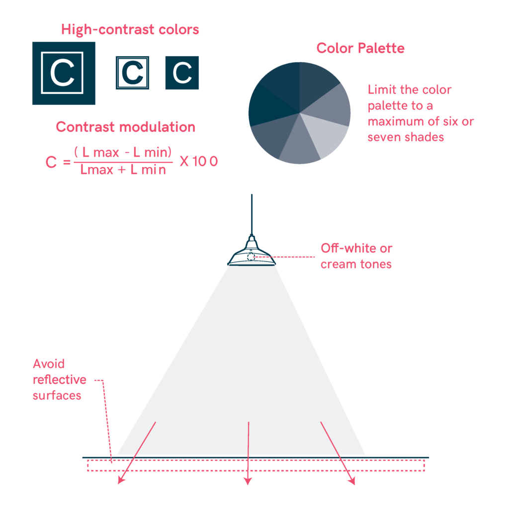
Proper use of color and contrast is essential to ensure visibility and understanding of visual elements. When combining colors, it is important to consider the diversity in visual perception so that everyone can distinguish them clearly.

- Use high-contrast colors between figure and background for key elements like text, doors, handrails, and controls.
- Prioritize light, contrasting colors to improve visibility for all users.
- Color as a primary visual cue, ensuring sufficient contrast with the surrounding environment.
- Maintain contrast modulation using the formula: (Lmax – Lmin) / (Lmax + Lmin) × 100.
- Limit the color palette to a maximum of six or seven shades, optimizing perception for diverse users.
- Avoid glare by using off-white or cream tones instead of pure white or reflective surfaces.
- Follow standardized color codes and shapes to enhance comprehension and consistency.
- Color should be complementary to reinforce information, as many individuals may have difficulty distinguishing certain colors
Sources
- https://biblioteca.fundaciononce.es/publicaciones/colecciones-propias/coleccion-accesibilidad/accesibilidad-universal-y-diseno-para
- https://www.punt6.org/es/books/espacios-para-la-vida-cotidiana/
- https://www.une.org/encuentra-tu-norma/busca-tu-norma/norma?c=N0043689
- https://observatoriodelaaccesibilidad.es/wp-content/uploads/2022/05/Guia-de-Accesibilidad-Cognitiva-en-Centros-de-educacion-infantil-y-primaria.pdf
- Carers
- Children
- Cognitive
- Cognitive abilities
- Decolonial perspective
- Digital
- Digital barrier
- Enviroment
- Environmental
- Gender and generations
- Gender perspective
- Hearing impairment
- Low-education
- Low-income
- Older people
- Other
- Physical abilities and features
- Sensory and Physical
- Socioeconomic
- Visual impairment