Contrasting colors and textures can make a playground more visually appealing and engaging for children of all ages. It can also help children with visual impairments to better navigate the space.
- Safe space approach (being able to look from outside before intervening to play)
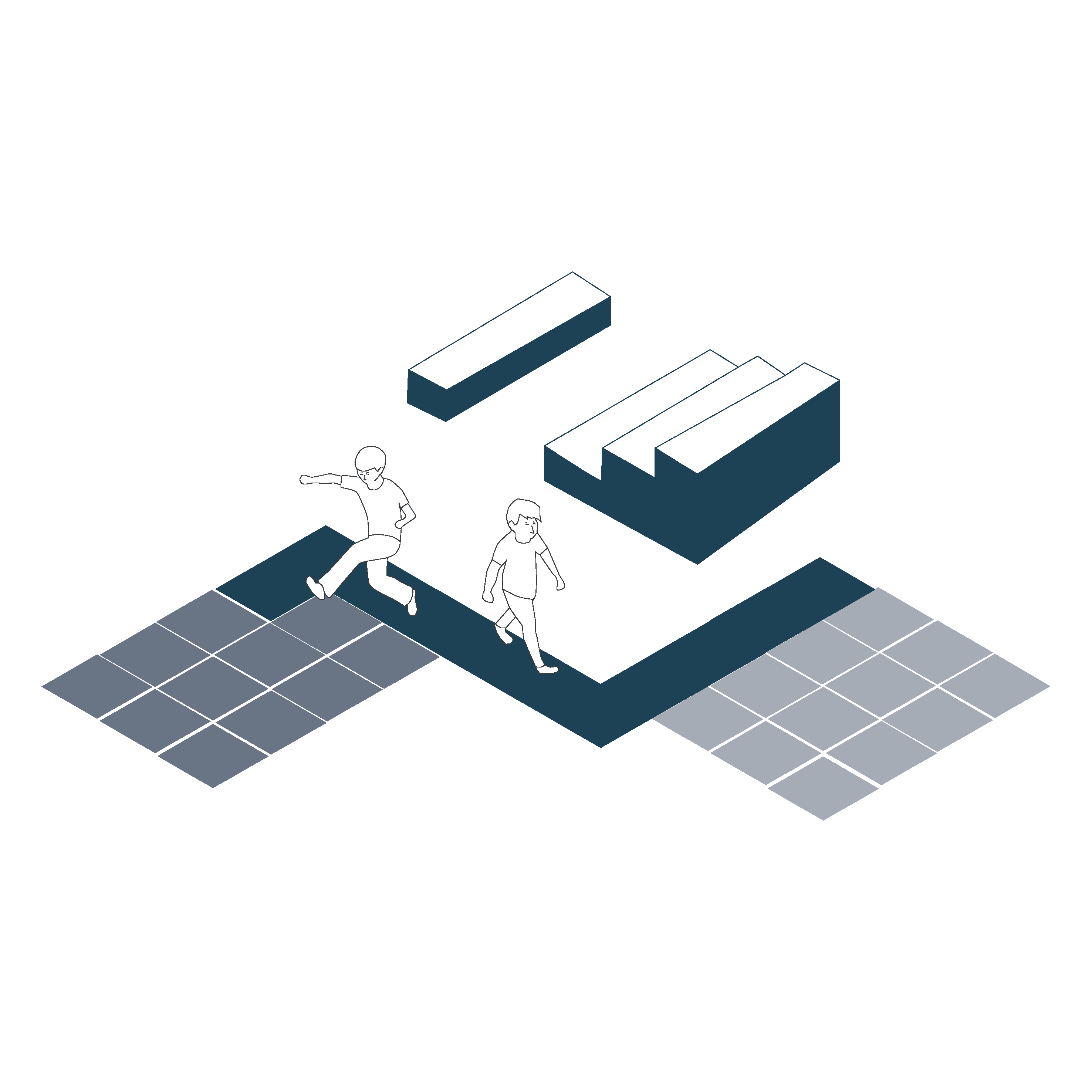
- There should be contrasts of colors and textures between the play and exercise elements, and the environment. Use colors and chromatic contrasts as a resource for orientation or Wayfinding.
- Use brightly colored play equipment that stands out against the background.
- Use a variety of materials for the play equipment, such as wood, metal, and plastic. Use texture and colour as a structuring element
- Use different textures for the ground surface, such as rubber mulch, sand, and grass.
- Use contrasting colors for the walls and fences.
Sources
- https://www.une.org/encuentra-tu-norma/busca-tu-norma/norma?c=N0060005
- https://openaccess.uoc.edu/bitstream/10609/147117/4/ASD-Publics_Design-Handbook_ENG.pdf
- https://www.punt6.org/es/books/espacios-para-la-vida-cotidiana/
- https://www.miteco.gob.es/fr/ceneam/recursos/materiales/guia-diseno-entornos-escolares.html
- https://www.oficinadeaccesibilidaduniversal.es/accesibilidad-arquitectonica/documentos/#movilidad
- https://ecuador.unwomen.org/sites/default/files/2022-11/GUI%CC%81A-10-B.pdf
- Carers
- Children
- Cognitive abilities
- Decolonial perspective
- Enviroment
- Gender perspective
- Hearing impairment
- Low-education
- Older people
- Other(+)
- Physical abilities and features
- Sin categoría
- Temporary
- Universal Design
- Visual impairment